Why mono
Every garment in this catalog carries a visual idea. That is the whole product. The typography on the page, on the hangtag, on the wall around it — that is framing. Framing should be quiet. The piece is the loud part.
The first version of this storefront leaned warm and editorial. A display serif, a paper-bone palette, a magazine register borrowed from the kind of shop that gets read more than it gets clicked. It looked nice. It was not honest. The clothes are not a magazine. They are a printed image, made once, on a substrate.
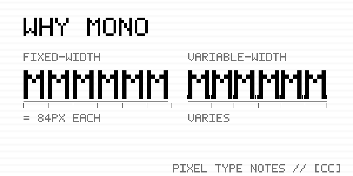
Mono fonts have an in-built restraint that other faces have to be argued into. Every glyph is the same width. No tail, no stress, no flourish. A letter is a slot, the slot holds a character, and the character is the point. The grid never tries to upstage what is in it. That is the right job description for a typeface that has to live next to the line a customer paid to wear.
It is also the native register of the customer. Mono is the typeface of code, of terminals, of receipts and lot numbers and JSON dumps and the inside of a deal memo where the columns finally line up. The buyer has spent a lot of hours staring at characters in a fixed-width grid. Putting the storefront in their working font is not a costume — it is just speaking the language they already think in.
The pixel face does a different job. It only shows up in the wordmark. [ CLOTHED ] / [ CAPTIONED ], stacked, bracketed, blocky enough to read as a flag from across a feed. A pixel mark is a signal, not a sentence — it announces which storefront you are on and then it gets out of the way. Run pixel through a paragraph and the paragraph stops being readable. So it does not.
The RGB chromatic aberration — the one- to two-pixel red, green, and blue split on the hero — is the same kind of restraint, used in reverse. It is a single moment. Hero, 404, the cart-add pulse. A flicker, not a texture. Anywhere else and it would feel like a TikTok filter ate the brand.
Black, white, mono, pixel, one green dot for status. That is the entire kit. If a piece on the page cannot justify itself inside that kit, the piece on the page is the problem.